
The problem
Pre-authorization and referral submission lived in the membership view. A provider office picks a patient, then tries to submit an auth or referral to the plan. In one-on-ones, I watched office staff fight the form: too many options, unclear labels, everything mixed together.
I took that suspicion to our health plan partners. We reviewed their reports and sat with their workflow. The pain wasn’t theoretical.
“We spend about 50% of our time fixing authorizations rather than approving or denying them. I spend a lot of time on the phone with providers trying to help them submit correctly.” – Health plan partner
Research
- Contextual inquiry (provider offices)
- Plan partner workflow reviews
- Usability sessions on live product
- Card sorting
- Prototype validation
- Partner error reports
I watched office staff fight the membership-view form in one-on-ones, then took that suspicion to plan partners: reports and ride-alongs showed repair work, not theory.
I also brought in people who know pre-auth workflows but don’t live in our tool every day. They ran the current product and said the quiet part out loud:
“This list is ridiculous which one is the right one? I’ll just pick this and write what I want in the comments.” – Usability session participant
Authorizations and referrals were jumbled. Staff couldn’t tell what the plan actually needed. Comments became a dumping ground for missing structure. Plan-side error drivers (wrong care type, missing clinical data, free-text dumps) later ranked the redesign.
Approach
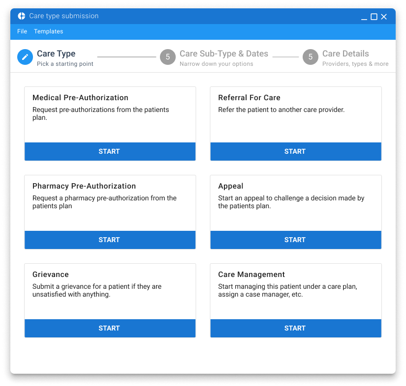
Split the catalog so the form only asks for what that care type needs—no more dumping truth into comments.
Hypothesis: clear primary and sub-types reduce bad submissions and plan-side coaching. Goal: fewer errors, less repair time.
Card sorting with plan partners and provider office staff produced the catalog. That segmentation powered a wizard-style stepper: each step controlled by care type, instead of a single overloaded form. We validated with prototypes (Sketch/InVision at the time), then refined through development with continuous usability checks. Templates and ICD-10 lookup came later for repeat submissions.
Results
≈90% reduction in error-driven rework
From partner workflow reports after rollout; templates later cut provider time further.
Relative share of plan-side correction reasons before the redesign.
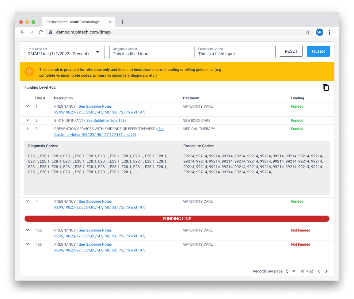
Feedback from plans and providers improved across the workflow. We later added templates to speed repeat submissions, and an ICD-10 lookup so offices can check billable codes without leaving the tool.
Why this still matters
When the catalog is a guessing list, people dump the truth into comments and plans clean up the mess. Segmenting care types and guiding only the fields that matter cut errors for partners—and it’s still how I structure dense healthcare forms: auths, referrals, assessments, anything multi-step.